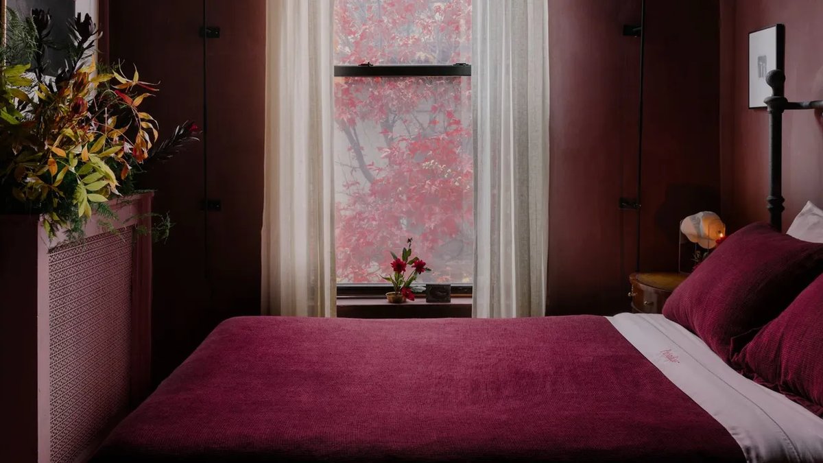
I have lived in six New York apartments in four years (don’t think too hard about that), and in each have been faced with the same predicament: How do I make this place feel three times its 300 square feet? I posed the question to a few interior designers who specialize in the small-space category, a favorite of ours at AD. And while some small spaces encourage you to live very simply (this Berlin studio has no bathroom door, for example), they all certainly excel at maximizing their space.
How did they think to paint the cabinets pink? Or turn every wall into a bookshelf without doubling down on the visual weight? I was seeing few signs of the typical myths for expanding the potential of your tiny space, and headed straight to the source for clarity. It turns out interior designers have either debunked or outright refuted the old standards for new approaches.
“White makes a room feel bigger”
This is perhaps the most famous—or infamous, these designers might say—advice for small spaces of all time. Architect Sarah Jacoby puts it simply: “White doesn’t make things bigger, it just makes it white.” The effect can feel cold and impersonal, especially depending on the shade (blues hurt you in this case). Jacoby’s instincts run the other direction: toward warm, saturated tones that make a room feel cozy and inviting. Don’t fixate on what the room isn’t, she says, but what it is at its best.
Emily Frank of Frank & Co. Home draws a distinction that reframes the whole premise: “White reflects light, but brightness and spaciousness are not the same thing.” In an all-white room, she finds, every corner and edge is clearly defined, which actually makes the perimeter of a space more apparent, not less. Her preference is full envelopment: walls, millwork, and ceiling blanketed with the same saturated hue so the eye stops registering boundaries. “Color can create atmosphere, depth, and even a sense of mystery, qualities that often make a small room feel larger emotionally than it is physically.”
A library wrapped in green millwork or a moody bar finished in charcoal cabinetry, she says, becomes a destination rather than an apology. Harris Reed’s bedroom depicts this perfectly: Deep, all-encompassing navy blues with red coral accents create a bold and consistent color story that cocoons the viewer instead of overwhelming them. This powder room in a Vermont Schoolhouse is drenched with Farrow & Ball’s Eating Room Red, a color that actually expands the tight space, while this Manhattan loft employs all-pink cabinets to counteract cold granite.
Alissa Friedman of Bright Design Lab calls her version of the approach color capping—wrapping walls, ceilings, and trim in a rich, moody hue to create what she describes as a seamless envelope. “It feels like a hug rather than a cage,” she says. In a small, low-light space, she finds that white reads flat and gray anyway; the color does more work.
Christene Barberich, who writes about her own apartment on the Substack A Tiny Apt., tested this theory on the smallest rooms in her own home. The two bedrooms in her Brooklyn apartment are ultra-tiny, and both are painted in two of Farrow & Ball’s darkest grays, Down Pipe and Hopper Head. “They both create such a dimensional feeling that actually activates a smaller space, almost like an emotional spark that draws you into the feeling as opposed to the dimensions,” she says.
“Pattern overwhelms a small space”
Frank isn’t sold on white-washed restraint here either. In tight footprints, she argues, personality matters more than caution. Graphic tile is one of her go-to moves: A repeatable pattern lends rhythmics flow so the eye moves around the space rather than landing on its edges. Saturated color and pattern, used with intention, can “draw you in and create depth rather than confinement.” This Brooklyn town house layers English textiles and plays with color drenching to maximize its tighter spaces but maintains its tidiness by paring back on decor. Where the rug, upholstery, and wall art deliver impact, the displayed objects are simple to balance the visual weight.
Friedman goes further: A bold, narrative-driven wallpaper, she says, is a power move (like this Federal-style kitchen in Denver), especially when paired with vintage sconces and custom hardware. “The walls disappear and the story takes over.” Her so-called jewel box logic holds that small rooms create drama precisely because of their scale, not despite it. Floral wallpaper, ambitious prints, ornate mirrors: In a small room, those choices land harder and create “a surprise inside.” Her one caveat: There’s a real line between collected and claustrophobic—keep visual weight in mind, and keep things off the floor.
“Small rooms need small furniture”
Friedman has a name for what happens when you follow this rule too literally: the Dollhouse Effect. “Instead of three tiny chairs, give us one substantial, heirloom-detailed vanity or a massive, dramatic mirror,” she says. A singular, well-scaled piece grounds the space and feels intentional, whereas a room full of underscaled furniture just looks miniature. In this Manhattan apartment, 345-square feet comfortably host a queen-size bed, a two-person couch, and a dining setup. Though the table leans small, it’s still a successful three seater, and the addition of the coffee table looks right at home in a setup where you might’ve considered sacrificing it.
Frank also condones this concept, saying, “When every piece is underscaled, a room can begin to feel fragmented and unsettled—tiny chairs, narrow tables, and diminutive case goods create more visual noise because there are simply more individual objects competing for attention.” Her preference is for fewer pieces with stronger proportions: a generously scaled chair, a substantial sofa, or a built-in cabinet that’s been thoughtfully incorporated. There’s a psychological dimension to it too, she adds, larger furnishings establish design confidence and relate a sense of permanence. “When the furnishings are appropriately scaled and intentional, the eye reads the composition first and the square footage second.”
Jacoby, who works primarily in New York City, notes that the sofas she sees in showrooms are often bigger than an entire apartment project. She prefers built-ins that are comfortable, efficient, and proportional—pieces that hide storage and carve out niches. For tighter budgets, she suggests simple storage furniture: a dining bench with a sizable interior, storage side tables, or nightstands. “Small spaces aren’t actually that small,” she says. “Think about how many people can crowd into a galley kitchen or an elevator. We don’t need as much room as we’ve been led to believe.”
The takeaway: Commit to the vision
Across all three designers, the same note surfaces: The small-space mistakes worth avoiding aren’t about going too far, but about hedging your own uncertainty. You’re choosing white paint chosen for safety rather than intention, small furniture out of proportion anxiety, and avoiding pattern because you fear its chintz or floral wrath. The rooms that work, these designers agree, are the ones where every decision is made on purpose, and confidently. Trust your instincts—if a color delights you, it will look at home in your space. Or, anyway, you can paint over it.