One of the most utilized econometric workflows in the last decade has been that of using vector autoregressive models. From research done by academicians to economists informing policy implementation have all utilized VAR models in some shape or iteration [think vector error correcting models(VECM) or Structural VARs (SVAR)]. It could’ve been for impulse response studies, endogenous variable forecasts or something as simple as arguing cross-correlation between temporal variables.
Unfortunately, one problem that VAR studies have not been able to solve for is breaking out the impact of one endogenous variable at a point in time on another into direct, indirect and aggregate feedback. Intuitively, this can be understood by the idea that if one variable affects another directly then we can connect the two explicitly in an arbitrary equation:
But if the variable only has an intermediate feedback onto another variable, we can connect them implicitly:
Although we are able to measure aggregate impact through orthogonal impulse-response functions, we cannot still break it out into indirect and direct feedback since that would require us to trace effects through EACH equation in the VAR model . This is a computational nightmare!
[Readers can be tempted to use SEM models but they also require us to a-priori define relationships within variables and then see how well the data fits our hypothesis; the problem we’re trying to solve here is “what are the relationships in the first place?”]
This article introduces a little talked about topic within the econometrics community. Causality Network Graphs. The idea of a causal graph is simple :
- if a variable, A, causes variable B then we visually draw an edge going from A ->B.
- We do this for all pairs of variables in the dataset. The direction of the causality matters as well. A can cause B but the opposite can also be true.
- The graph formed using the set of variables/nodes and edges is called a causality network graph, G(e,d). Where e is the number of edges and d is the number of vertices (variables) in the dataset.
- For computational purposes we represent G(e,d) using an adjacency matrix.
Causality network graphs become important in panel data research as a way to visualize variables and how they are connected to others. As a result, the graphs become easy candidates for quick and inexpensive inference measurement. Here, we’re going to attempt to try and build a G(e,d) using real life data and also explore, in layman’s terms, how these networks can help us begin to understand direct and indirect effects between 2 endogenous variables.
For our reproducible example, let’s look at log returns of an ETF that tracks the the NASDAQ-100 index, QQQ. Additionally, we will also look some technical indicators like Relative Strength Index (RSI), Bollinger Percent B(pctB), Volume, Range, and prices of another security – SPY and see if network graphs can help us understand how structurally causal these indicators are to the day-to-day price movements of QQQ, if at all. We’re going to suitably transform these variables to ensure stationarity. See below for an initial plot of the variables we’ll be working with :
The novelty of G(e,d) comes from the rules we use to build it. One of the easiest ways to build G(e,d) could be to look at the correlations between these variables and only select highly correlated (cor > |0.6|) edges to make the graph. See below for the output of a network graph built using this rule:
It appears as though all the variables are connected to others in both directions. 2-way connectedness may impart information on which variables are connected but not how they are related. For network graphs using correlation coefficients as the rule to build graph edges, we don’t need a directed graph given the implied symmetry. Unfortunately, the graph does not give us any additional insight. We know correlation does not equal causation. This was a test and numbers agree.
Next, let’s use pairwise granger causality to build a bivariate Granger Causal Network Graph. Here the direction matters and we can build a directed network. For G(e,d), each edge indicates whether the lags of the independent variable are, up to a given level of significance, important in explaining variation in the dependent variable on top of its own lags. This is achieved by running a restricted and unrestricted model, as shown below, and comparing the distribution of the F-test statistic :
With 1% as the p-value cut-off and a AIC minimizing criteria to select optimal lags for the granger test (9), a bivariate granger causality graph for our dataset looks like below:
Now we’re getting somehwere. Although RSI seemed to be very weekly correlated to QQQ log returns, it has a 99% significant pairwise granger causal effect on QQQ log returns.
QQQ log returns seem to have aggregate causal implications from:
- RSI
- Range
- SPY log returns
- pctB
Note that QQQ log returns are not directly causally related to QQQ Volume. However, if we consider the chain – Volume > Range > QQQ log returns, we might say that volume has an intermediate causal implication on QQQ log returns as well.
What about other variables? Below are some paths we can take from RSI to QQQ log returns:
- RSI > QQQ.diff [Bivariate Direct]
- RSI > SPY.diff > QQQ.diff [intermediate]
- RSI > pctB > QQQ.diff [intermediate]
- RSI > pctB > SPY.diff > QQQ.diff [intermediate]
- RSI > SPY.diff > Range > QQQ.diff [intermediate]
- RSI > SPY.diff > QQQ.Volume > Range > QQQ.diff [intermediate]
Remember that this list is not exhaustive. There are multiple other paths leading from RSI to QQQ log returns based on the network above.
Just by visualizing our data as a network we can start to make the idea of direct and indirect feedback more intuitive!
Unfortunately, one problem stares us right in the face – using pair-wise granger causality to deduce structural variables in the data we always end up measuring causality between two variables in isolation when it should take into account all the dynamics implied in the dataset.The network graph revealed that there can be many intermediate feedback paths between two variables AND also their aggregate effect. It becomes crucial to know how the aggregate causality is divided between direct and intermediate effects to quantify how structurally important one variable is on another. For instance, if the aggregate signal shows that RSI granger causes QQQ.diff but the effect is almost entirely through intermediate feedbacks then in the network graph representation, RSI and QQQ.diff should not be connected through a direct edge; They should lie on a common path instead.
Measuring two-way granger causality in isolation may help with variable selection but does not help us unearth structural information about the process. Rightfully, this is one of the biggest critiques of granger causality – it helps with in-sample fitting not out of sample forecasting.
Structural causality is an absolute measurement. Therefore, any measurement for structural causality should be able to control for each intermediate effect or path to be be able to title a variable as structurally causal.
As a solution, one can be tempted to argue that if we use an entire block of time series i.e. use restricted and unrestricted VARs with all other variables of interest included, we can measure the structural importance of one variable on another and also be able to see the direct effect.
Yes and No. Below is what the relevant equations from the VAR’s will look like:
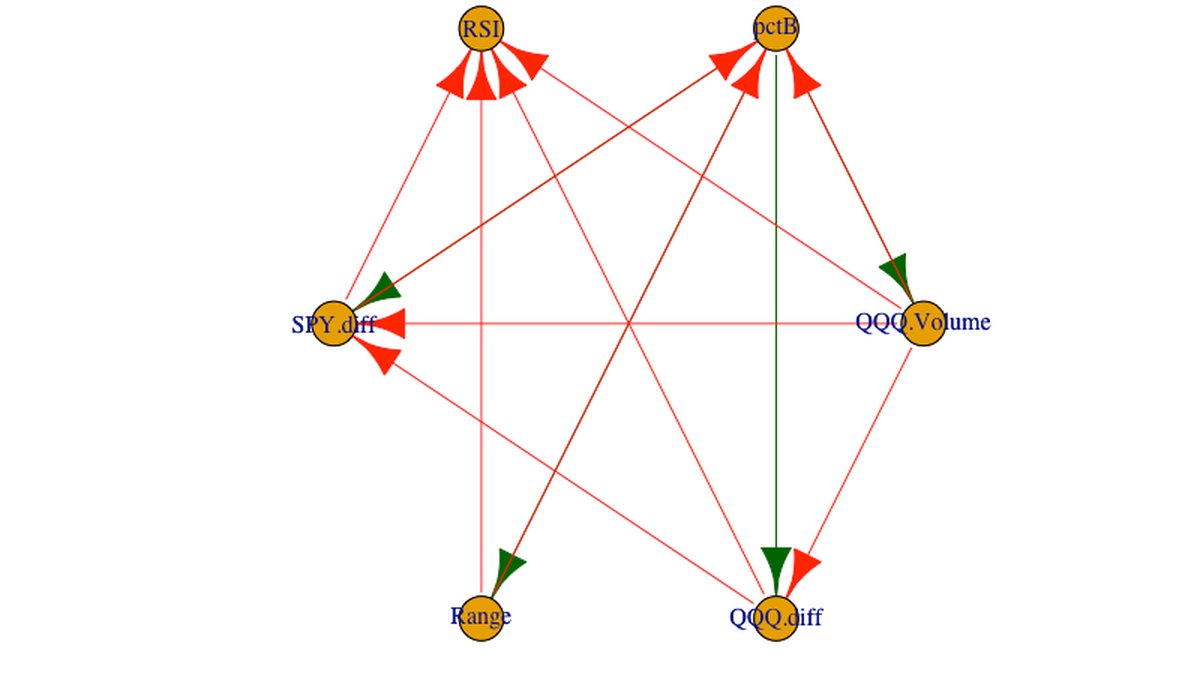
VARs help understand the aggregate aspect of granger causality better since all the variables of interest are being used. Unfortunately, this time around we’re not able to control for direct and intermediate feedbacks individually to measure their strength – analogous to the bivariate case, we’re still measuring causality in isolation. Consequently, the results from bivariate and VAR based rules build very similar network graphs. Below is what the graph built from the multivariate approach looks like :
One big difference here is that now we’re seeing some feedback being spilled over back to RSI and pctB evident from the two-way causal edges compared to the bivariate case, at a given level of significance.
Here’s a look at the additional edges that our each of our setups give compared to the bivariate case:
This gives us further insight into some of the intermediate feedback paths in our data. Not only now does the idea of intermediate feedback “look” intuitive but the difference in the networks made using 2 different rules help us understand the effects a little better :
- PctB has strong explanatory power on QQQ.diff in the bivariate case but it disappears when we include other variables i.e. VAR network – The calibrated equation for QQQ.diff is below. Additionally, there is QQQ.diff’s orthogonal impulse response to pctB:
Only the first lag of pctB is significant in the equation. A unit increase in pctB casues 0.01707 unit increase in QQQ.diff directly based on the equation. But the impulse response measures an impact of ~0.008 unit increase over 1 period. This means that there is a much stronger intermediate feedback offsetting the direct impact as it permeates through the system. Perhaps, pctB affects other channels which in turn impact QQQ log returns, more so than directly. Should traders consider using buy/sell signals from pctB paired through other indicators and not directly on log returns (at least for this dataset)?
- QQQ.Volume did not have any explanatory power over QQQ.diff in the bivariate case but did in the VAR case – only **** the 5th, 6th and 8th lags of volumes are significant in the QQQ. diff equation but we see a significant impulse response from QQQ.diff in the 1st period as we shock volume :
The inference leads us to believe that for the first few lags, the impact of QQQ.volume over QQQ.diff is heavily skewed towards intermediate feedback than direct effect.
- SPY.diff does not have any explanatory power over RSI in the bivariate case but a signal pops up in the VAR network – none of the lags of SPY.diff are significant in the VAR model, yet we see a significant orthogonal response from RSI when SPY.diff is shocked:
Here again, we’re able to see how the network graphs helped unearth a indirect feedback from SPY.diff to QQQ RSI that we would not have noticed given the lack of significance of the caliberated coefficients.
We can continue the exercise for other edges and start to make similar inferences. Firstly, we were able to comment on whether, at the same lag, how the aggregate effect of one variable on another is balanced between direct and indirect effect; and secondly, how does the balance of direct to indirect impact change over lags.
Since this network is the difference between the 2 graphs we can only know that strong indirect feedback exists between 2 variables but we cannot :
- Comment on the distribution or strength of the direct to itermediate effects over a period of time.
- Comment on the path of the indirect feedback between two variables, only that it exists.
- Comment on weak indirect feedback between variables.
The insights we can draw from network graphs are an untapped resourse. If we change the rules we use to draw G(e,d) we can come up with new insights almost instantly.
An extension to the use of Network Graphs, more importantly Granger Causal Network graphs is how we can use the topology implied in these graphs to better understand our datasets. I’m actively working to build out a conditional granger causality network methodology and analyse its topological aspects to break out direct and indirect effects. The assumtion being – there exists crucial structural information beyond the frequency domain for data; and if we were to shift domains from frequency to adjacency matrices we might be able to recover a deeper relation between variables. Perhaps we can get to structural equations for an SVAR implied in the data without any a-priori assumptions on them.
For time series, VAR modeling stands to gain the most from such advancements since variable selection still heavily depends on information embedded in temporal moments of correlated time series. If this article helped you get some ideas, feel free to reach out!
Vedant Bedi is an Analyst at Mastercard working on the NAM portfolio development team. Vedant holds a Bachelor’s degree in Mathematics and Economics from NYU (magna cum laude class of 2019) and holds an avid interest in data science, econometrics and its many applications in finance.
Vedant is also an inducted member of Phi Beta Kappa (NYC chapter) – the oldest academic honors society in the United States.